Foundation Art and Design
Tuesday, 22 January 2013
Sunday, 30 December 2012
Shuttleworth
For my first drawing I used wet bark and mud for the tree trunk in the foreground, which had the most light projecting onto it, and ink and mud for the trees further in the background with charcoal being used for the cross-hatched foliage. I really enjoyed creating the drawings from a wide variety of materials as you're able to make the piece much more visually interesting and bring much more texture to it.
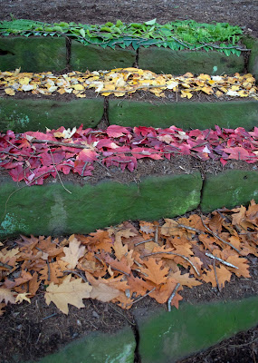 We collected a bin bag full of green, yellow, red and orange leaves and arranged them along four outside steps. Our inspiration came from Andy Goldsworthy's arrangements of leaves in specific colour orders and Andy Gallaccio's way of arranging natural objects in unnatural ways. Due to the weather on the day we had to improvise with our idea and use twigs to keep the leaves down. We thought that using twigs would be a good idea as it fit in with the other natural materials and was a good use of what we could find around us.
To add another aspect of interest we arranged some of the leaves in a repetitive pattern, again using inspiration from Gallaccio's work by putting the leaves back from where they came from, but in an abstract manner-quite like her piece 'Because Nothing has Changed'. I think that both parts of the piece worked well together as, although leaves are found on the ground and on trees, we arranged them in a way which you wouldn't normally find them that almost makes you appreciate their appearance and beauty when in multiples.
I was really pleased with the outcome of our end piece as, although it is quite simple, I think that this makes it that bit more effective. We wanted to create something which was unnatural. Although leaves are found on the ends of branches and fallen leaves found on the ground, the way in which we arranged the leaves was in an abstract and visually attractive manner, highlighting their natural beauty when grouped together in such a way.
Monday, 26 November 2012
Paper Engineering
I was first inspired by Ron Resch’s paper folding because of the geometric patterns he created, making me want to create a contemporary looking piece by using similar geometric forms. This then lead me onto James Patmore’s work, an artist who created furniture and lighting himself. I liked his NaCI installation light shade in particular as it’s made up of a cluster of geometric shapes. I experimented with trying to create similar, almost cube like, forms from paper but found this difficult as they needed to be properly measured nets for the sides to fold correctly and match up. After trying to use a ready made geometric net but finding it too limited, as well as the fact it wasn’t creating the kind of shape I wanted, I played around with plain pieces of paper to try to and create more simple, individual shapes that fitted together to create a bigger piece.
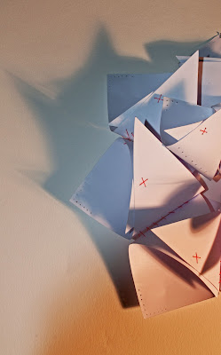 I used a red thread to join the forms together, creating a contrast against the pure white of the paper.
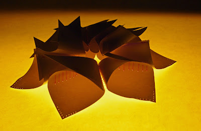 I experimented with putting my piece onto the light box in the dark room, which gave the piece a nice orange, almost fiery, glow.
I also tried putting LED lights in the center of the piece and inside each segment. Putting them in each segment gave an interesting effect and a different burst of light was projected from each one.
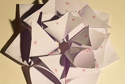 As well as experimenting with light behind it and amongst it, I projected light onto it to try and create some interesting photographs of the forms and delicate, time consuming, joining method.
 Projecting light onto the piece also created some interesting shadows.
Mark Making
We begun the Graphics workshop by experimenting with mark making using a variety of dry materials, starting off with pencil and then moving onto things like chalk, grafite and charcoal.
Charcoal and ink
Acrylic paint - Ink dragged down the paper using a piece of cardboard - Ink and acrylic paint
My favourite
process was the dye and bleach because of the contrasting negative and positive
colours they created when added together.
I like that I was able to achieve an almost glowing effect by lightly
painting streams of bleach onto the dye.
Using the powdered dye on wet paper also gave an effective reaction,
reminding me of the shots you see of galaxies in space because of the way the
dye bled outwards, leaving specks of the powder in the center.
Charcoal and ink
Masking tape, ink and acrylic paint
Acrylic paint - Ink dragged down the paper using a piece of cardboard - Ink and acrylic paint
The three
pieces I chose to frame were the ones which I felt had worked the most
successfully, but also the ones which complemented each other, mainly because
of the similarity of the vertical wavy lines each of the three pieces had. The techniques and materials I used were all
very different, which I think makes the pieces more interesting. For the first piece of mark making I squeezed
UHU glue in wavy lines, almost like tree branches, and then grated a piece of
black chalk on top of the glue, giving it a soft black texture. I tried to make the bottom half very black
and blended the chalk upwards so that it gradually became more subtle. I then used a straw to dip into black and
white acrylic paint and created small circles around the lines, once again
making the bottom half darker than the top.
I created all three marks in this way, using the materials to make a
gradual transition from dark to light, with dye, bleach and acrylic paint for
my second piece, and acrylic and black chalk dusk for the third.
Ceramic Towers
Top - Middle - Bottom
After being set the task of creating a ceramic tower in groups of six we chose to focus on texture, by imprinting as many different objects, materials and surfaces into the clay as possible. We used blue and red slip in order to add colour to the piece, as well as dark coloured oxides to contrast these two colours and to help bring out the different textures.
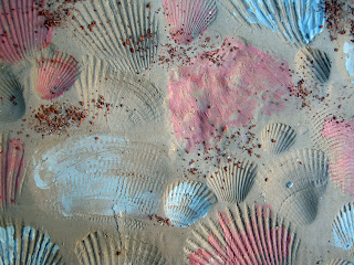
A variety of different shells pressed into the clay and highlighted with red and blue slip to bring out their texture .
Footprint with grog to add a gravely texture.
Shell imprints with coloured slip over the top to highlight texture and add interest, as well as dripped colour oxide to give a watery effect.
A range of different tools such as Lego and patterned rollers to add as many different textures to the clay as possible in one small space.
The structure we chose for our piece was; one large component for the base of the tower, four for the middle section, and four slightly smaller ones for the top. One of the advantages to having the design of our piece based around texture was that each pair within the group could use their imagination to create something different and individual as our design wasn't restricting. This then meant that the final outcome would be much more visually interesting because of the variety of tools, methods and mark makings. However, one thing which we did keep the same was the use of red and blue slip, which each pair incorporated into their section in order to bring them all together.
Friday, 7 September 2012
We were given a brief to go around the areas around the college and around Bedford town and take a range of different photographs focusing on composition but ensuring that a subject from your group is in every photograph. We were given some ideas of what kinds of photo to take but also added our own.
Close up with subject looking straight into the camera
Experimenting with light and long exposure
Before
After
Playing with perspective
Using the natural light from the window to light the photo
Portraying the emotion of sadness/loneliness
Subscribe to:
Comments (Atom)


