Friday, 7 September 2012

We were given a brief to go around the areas around the college and around Bedford town and take a range of different photographs focusing on composition but ensuring that a subject from your group is in every photograph.  We were given some ideas of what kinds of photo to take but also added our own.

Close up with subject looking straight into the camera


Experimenting with light and long exposure

Before

After


Playing with perspective


Using the natural light from the window to light the photo


Portraying the emotion of sadness/loneliness


Using a collection of our work from previous school projects and our own photography work we constructed a home page for our website by combining these together in an artistic way using the skills which we had previously learnt on Photoshop.  I used the filter 'Poster Edges' on both my drawing and Instagram photographs, creating an almost cartoon appearance to them.  I used a photograph from my art project last year and focused in on a certain area of the light which I particularly liked, creating a purple and pink light combination for the background, and then using the artistic filter 'Paint Daubs'.  


To fit in with the colours of my background I used the skills learnt when editing the photograph of Angelina Jolie to add subtle colour to the eyes and lips of my girls face.  I also smudged the hair over one of the Instagram photos, using the 'Clone Stamp Tool', in a windswept fashion.  Doing this connected the drawing with the photographs as it subtly sweeps over the corner.
I added well known sayings to my photographs, relating to the objects and places which I had chosen to represent myself.  I used a range of different fonts which I felt were appropriately linked with the saying and photographs and chose to stick with the colour white for all of the text so that it was easily read against the various coloured backgrounds.

B movie poster


Using all the tools and techniques we'd learnt from the workshop we were asked to create a poster for a B movie film, and given a title to base it on.  We were given a limited choice of photographs, meaning that we had to think carefully about how we used and combined them.  My partner and I chose a photograph of a deserted island for our background to represent the land where Professor Spinebender takes his captured humans and changed the colours, focusing mainly on the sky, in order to add a higher contrast to the yellow.  We used red for the text as it stood out well against the yellow of the sky, but also because these are two colours which we found were typically used on B movie posters, as well as the plain, block type text.  We combined the head of a dog with a human body and placed the layer behind the body as the arm is in front of it.  Doing this made it look more realistic as though they were connected.  We then did the same with the tigers head but also added an arm to make the fact that they had been genetically engineered even more prominent.  Using the artistic filter 'Poster Edges' we gave the background and genetically engineered creatures a more cartoon appearance as though they had been hand drawn like the real B movie posters.  I feel that, using the techniques we were taught, we were able to successfully create an professional and effective looking poster.

Photoshop workshop

Before creating our B posters we were introduced to the basics of photoshop.  We learnt how to effectively crop a photograph and add text, as shown below on Nick.

We then had a go at changing the eye and lip colour on a face using the 'Eliptical Marquee Tool' to select the iris, then changed the colour by moving the 'Hue/Saturation' balance and the 'Colour balance' in order to add more or takeaway more of a specific colour, such as magenta, red or blue.  We did the same with the lips but used the 'Magnetic lasso Tool' to select the difficult shape of the lips more accurately.

Using all the skills which we'd learnt we cut out the viking figure using the 'Magic Eraser Tool' and placed him onto a background of our choice using the 'Transform' tool to scale him down.  We were then told to also add a bug or animal, removing its previous background in the same way.  However, I also used the 'Eraser Tool' to get in between the smaller gaps to get rid of all the white.

Constructed Drawing


We began by going out by the riverbank and finding an area that was interesting enough, with a foreground, middle ground and background, to do a small sketch of.  This sketch was not so much about creating a pretty drawing but about taking down the information of the surroundings so that we were able to turn it into a constructed drawing later on.  I also collected some rubbing's from the trunk of a tree which I thought may help me later on when trying to re-create the different natural textures.

Once we'd done a few drawings of different areas we chose one, or a combination, and made a plan.  I practised different techniques with the cardboard, for example different ways of cutting into it, ripping it, and painting onto it.
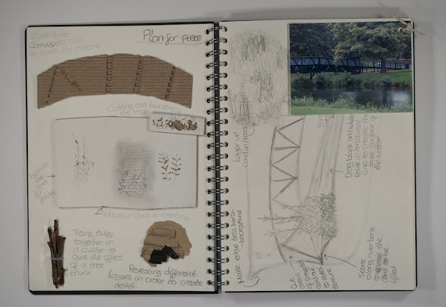

I researched three different artists whose work I felt had techniques which I could learn from and incorporate into my piece, such as Pat Steir's splashes of paint, creating a watery appearance and Anselm Kiefer's woodland piece using a range of different materials to create texture and bring the piece to life.

We then had to transform our drawings into a three dimensional piece, using only black and white materials to create tone.  I tried to use a variety of mark making, materials and techniques to make it as visually interesting as possible.


Newspaper tree, using sticks for the trunk and branches which was an idea inspired by Kiefer's work as he uses natural materials within his pieces.


To give a mixed texture and create a feeling of foliage I used ripped up pieces of corrugated cardboard, representing the different tones with black and white chalk.


As the bridge is very structured I cut up pieces of string and layered them next to one another, bit by bit, to replicate the


As I was trying to create a foreground, middle ground and background to my piece I decided to cut into some of the cardboard that was further away in order to set it back a bit, which I think worked effectively and gave a nice texture for the grass.


To represent the reflections of light on top of the murky water I used Steir's technique by splashing white paint on top of the black.